Project Gallery


London Museum, Smithfield
THE LOCATION
The London Museum is taking shape in the historic Smithfield market buildings, a once-in-a-generation cultural project that will breathe new life into the Victorian General Market and the 1960s Poultry Market. The museum's permanent galleries are due to open in 2026, with the adjacent Poultry Market spaces following thereafter – creating a major new destination at the heart of the City.
Smithfield itself is a storied corner of London – where centuries of trade and commerce meet today's creative city. The museum's vision is to be part of the street: opening early, closing late, and acting as a lively civic space that reflects London's 24-hour rhythm. That context informed every design and installation decision we took when dressing the site hoardings.
Our latest scope sat along three elevations of site hoarding – Charterhouse Street, Farringdon Street and West Smithfield – forming a 120-metre run at a consistent 2.4 m height. This part of the estate notably descends along Farringdon Street, creating a series of level changes that, left untreated, can fracture the visual flow of a campaign. The Embrace team has supported the museum's transformation at Smithfield for several years, with earlier phases of hoarding and archway graphics on the same site; that legacy knowledge helped us plan for architectural quirks and heritage sensitivities around the markets.
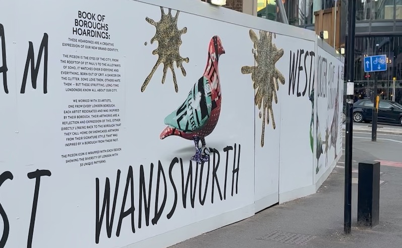
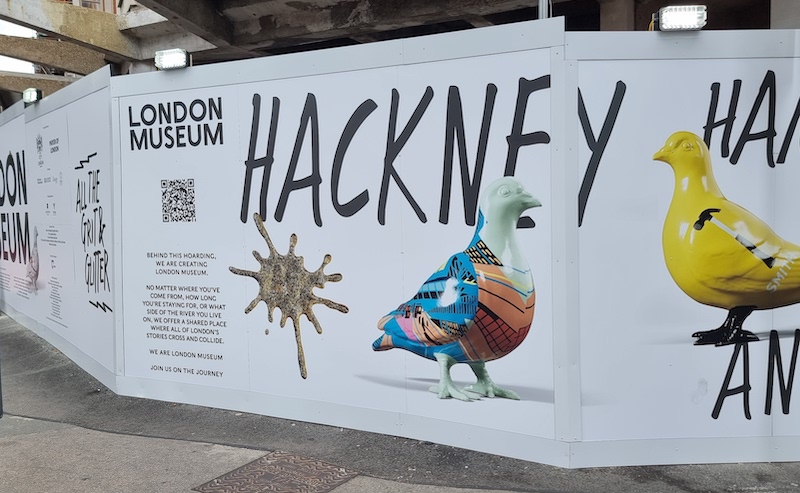
Crucially, the hoardings also act as a public-facing canvas for the museum's refreshed identity – a bold, conversation-starting mark that pairs a white clay pigeon with a glittering 'splat' designed by Uncommon Creative Studio. It's a playful emblem of London's grit and glamour, and a perfect fit for a perimeter that meets thousands of passers-by every day.
THE BRIEF
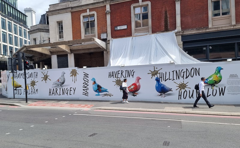
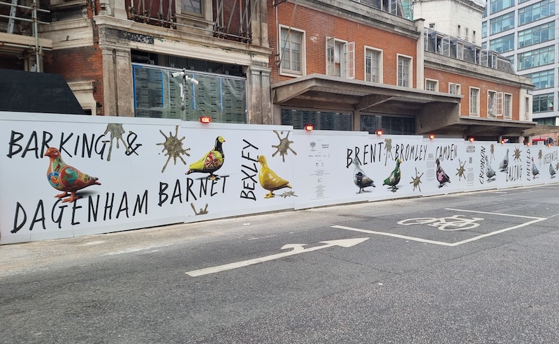
Our client and Uncommon provided the distinctive creative concept. The client's campaign celebrates Londoners and London's boroughs through a flock of giant pigeons – each bird wrapped in a different pattern.
Alongside the creative direction, the museum's own brand story underlines the thinking: the pigeon as "eyes of the city," equally at home on rooftops and alleyways; a symbol that captures London's dualities. The museum worked with 33 artists – one from every London borough – to express that diversity through unique patterns and styles. Our role was to translate that narrative into continuous, readable hoarding graphics that feel cohesive from street level, bus top, and across intersections.
Embrace was invited back to produce and install new creative hoarding graphics across three street elevations—approximately 120 metres in total at a 2.4 metre height.
Continuity was a key component of the brief – the line of hoarding drops in stages along Farringdon Street. Our task was to absorb those level changes while maintaining a seamless, premium look across long runs and street junctions. The museum's perimeter is part of a busy walking route and a prominent façade; any mismatch at step points would be amplified.
As Managing Director Greg Forster put it:
We've been involved in this part of the project for several years now, and this latest instruction is easily one of my favourite ACP installations. The creative concept is brilliantly whimsical: 33 giant pigeons, each designed by a different artist representing London's boroughs, complete with enormous glittery gold pigeon poop splats! Let's hope the local birds don't get too territorial and decide to add their own artistic touches to this fresh new canvas!
THE SOLUTION
Survey-led planning for stepped runs
We began with a detailed measured survey of each elevation, focusing on the staged drops along Farringdon Street. Instead of treating these as interruptions, we designed the artwork so each step became an intentional rhythm break—aligning pigeon silhouettes, splats and background fields to "hand off" cleanly at every change in height.
Artwork adaptation without diluting the brand
Working from the museum's supplied creative, we prepared production-ready files for long-run hoardings. The objective was fidelity to the brand while optimising for viewing distance, lighting changes and the realities of a construction perimeter.
- Scale & legibility. We tuned the relative scale of birds and splats so each figure reads crisply at speed and at oblique angles—especially on the bends from West Smithfield into Farringdon Street.
- Edge discipline. Key graphic edges were kept clear of panel joins, corner posts and lockboxes, and we applied repeatable anchor positions for the most recognisable elements (beaks, eyes, tail tips) to avoid "drift" over long distances.
- Colour management. London's weather is a designer: sun, shade and street lighting can shift colours dramatically. We balanced the palette for consistency across three streets, ensuring punch without sacrificing harmony when panels move from shadow to direct light.
The result preserves the museum's playful identity – the white clay pigeons and the wink of glitter.
Seamless joins across three streets
Charterhouse Street, Farringdon Street and West Smithfield don't behave like a single wall. Corners, crossings and changes of vista are constant. We plotted "continuity cues" that help the campaign feel like one coherent story:
- Corner choreography. At junctions we wrapped the flock around the turn, so a bird "leads" you into the next elevation.
- Pacing the flock. The 33 birds appear in a curated sequence so no pattern clusters or repeats dominate any one street. Where the hoarding line staggers, the next pigeon takes charge, reinforcing momentum.
- Story markers. At natural pause points—near site gates or viewing gaps—we introduced larger splat motifs and short lines of copy to echo the brand tone without overwhelming sightlines.
Precision installation on a live street
Our installation programme coordinated closely with the main contractor's site access windows and the street's busiest periods. The team worked to a pre-agreed phasing plan, lifting, placing and checking each panel against our module drawings before moving to the next run. The stepped sections on Farringdon Street were pre-noted with millimetre-level offsets so installers knew exactly where the "hand-off" should occur from one height to the next.
For quality assurance, we used a simple but effective three-point check at every step:
- Sightline test (walk-away read);
- Join accuracy (critical-edge alignment);
- Continuity (does the flock still "fly" across the step?).
Only when all three passed did we move on.
Why this matters for the client
Great hoardings do more than hide a site—they build anticipation, explain change, and make places feel looked-after. Here, the museum's identity does a lot of heavy lifting: it signals a confident, inclusive civic project in the making, where "the grit and the glitter" sit happily together. Our job was to let that idea sing—cleanly, continuously and at scale—despite the topographic and architectural variables of a complex city block.
Outcomes at a glance
- Cohesive 120 m perimeter across three streets, reading as one continuous campaign.
- Flawless step transitions along the descending Farringdon Street run, preserving visual rhythm.
- Brand fidelity to London Museum's new identity—playful, provocative and unmistakably "London."
If you're planning a high-profile hoarding on a complex city site—and want a solution that solves the tricky bits without losing the creative spark – let's talk. Embrace specialises in design-led, technically disciplined perimeter graphics that turn construction into placemaking.
The project was delivered on time and to budget, with the Embrace team coordinating seamlessly with the main contractor to keep works on programme while achieving the creative and technical ambitions of the brief.